Dealer Connect Rebrand
The broadcast aims to inform, inspire, and connect our dealer community. Through smart, design-forward storytelling, dynamic content formats, and moments that entertain, it highlights innovation, celebrates success, and shares expertise—with the goal of driving growth and affinity for Haworth across the dealer channel.
Role
Creative Direction, Styling, Motion Design, Messaging
The Logo
The Dealer Connect logo presents the program as the place for dealers to come together, share experiences, and gain knowledge.
Haworth + Dealer Partnership
The overlap within the logo represents the strong partnership between Haworth and our dealers, working together to achieve common goals. It signifies the sharing of valuable information and resources, ensuring both parties benefit and grow, with a focus on mutual success.
Source of Information
The directionality of the C is a nod toward a location marker. It symbolizes our commitment to providing the latest, targeted, and specific information that is easily accessible and relevant. We guide dealers to the right tools and resources, help them navigate through content, and ensure they are always informed and supported.
Unexpected color pairings support the design-forward appearance. The colors can also be blended to create interesting gradients and add flexibility to the branding.
Color Strategy



Color Pairings
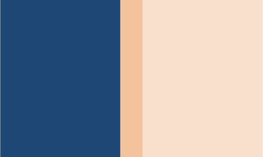
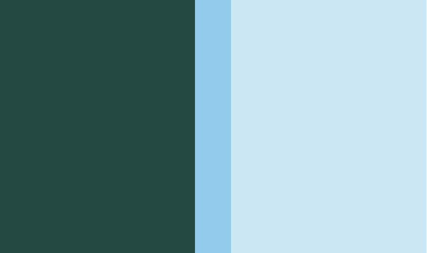
The color pairings are used to create definition between the three main segments within the show.
Deep Red + Bright Green Tint = Sales & Design
Dark Blue + Bright Orange Tint = Knowledge, Vertical Markets, & Brand
Deep Green + Bright Blue Tint = Product
Medium Brights
Medium Bright companions to the tint colors add subtle color variation as needed.
Gradients
Gradient formulas use one dark color with its medium-bright color pairing, plus one more medium-bright color for added depth and contrast.
Color in Imagery
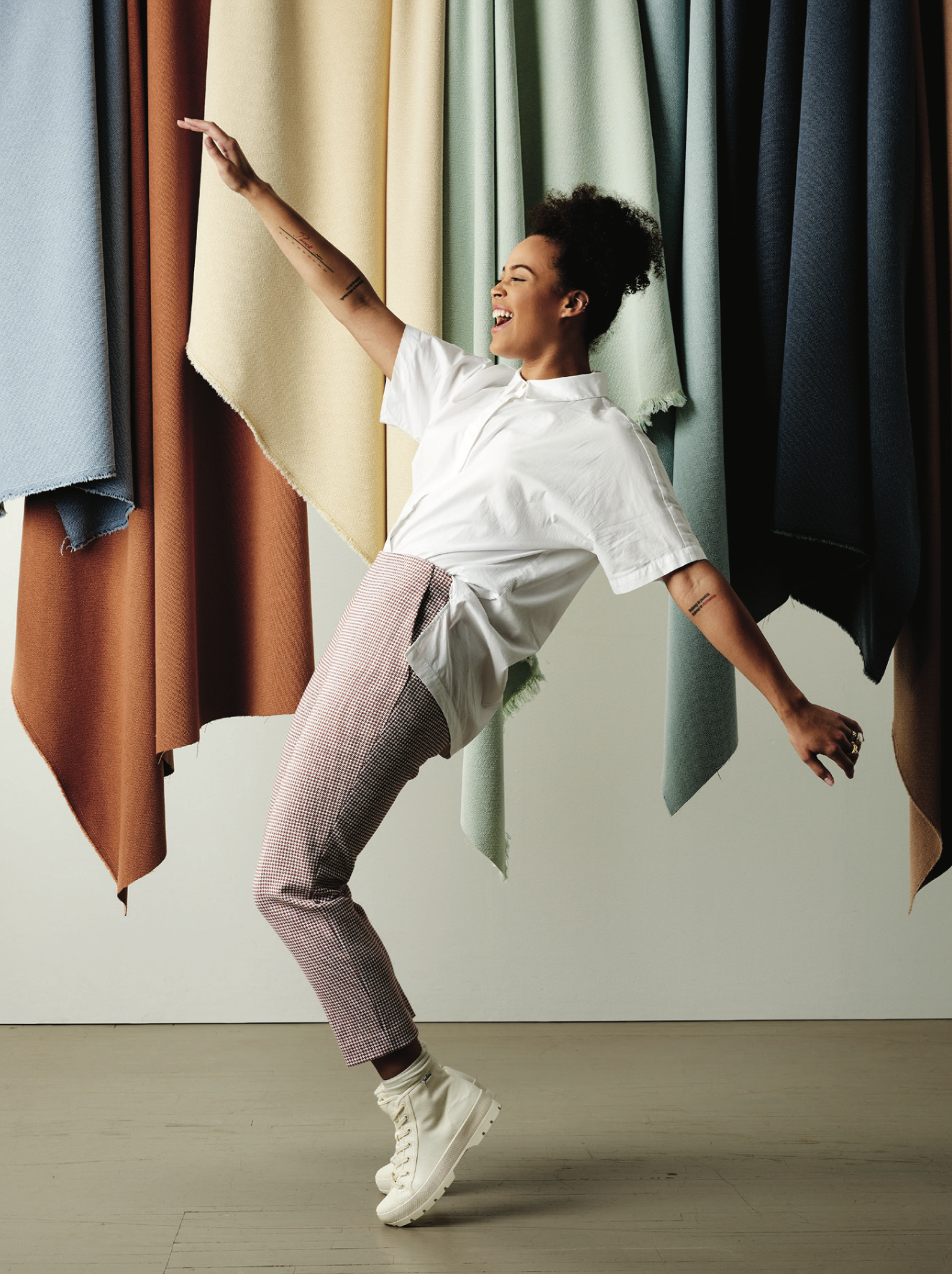
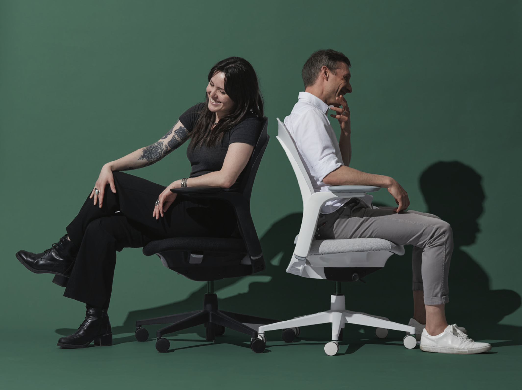
Imagery brings the Dealer Connect brand to life—capturing moments that feel relatable, engaging, real, and fun. An important aspect of the Dealer Connect identity is incorporating color not just as solids, but as texture and in imagery to create depth. These techniques can be used for both photos and videos.
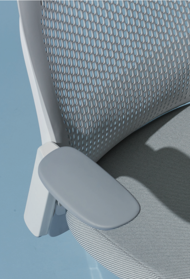
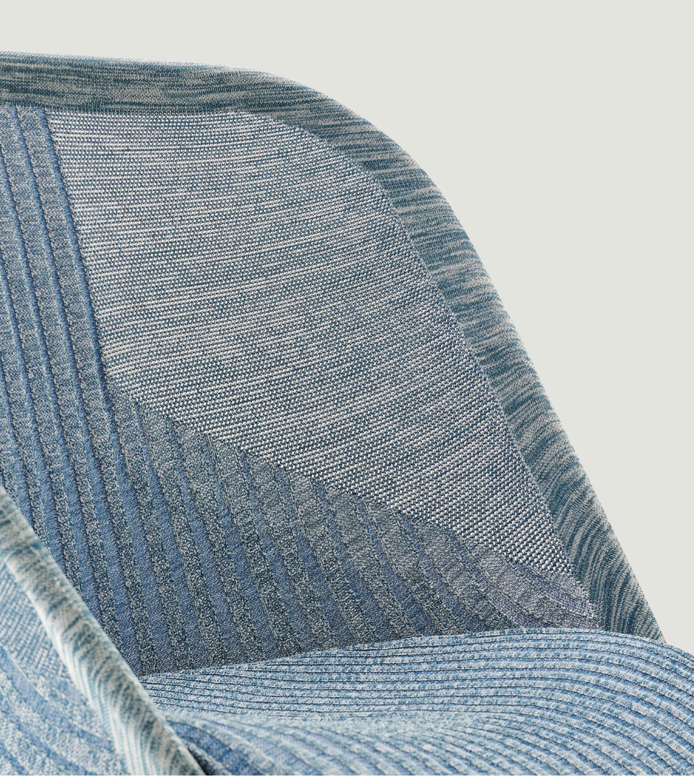
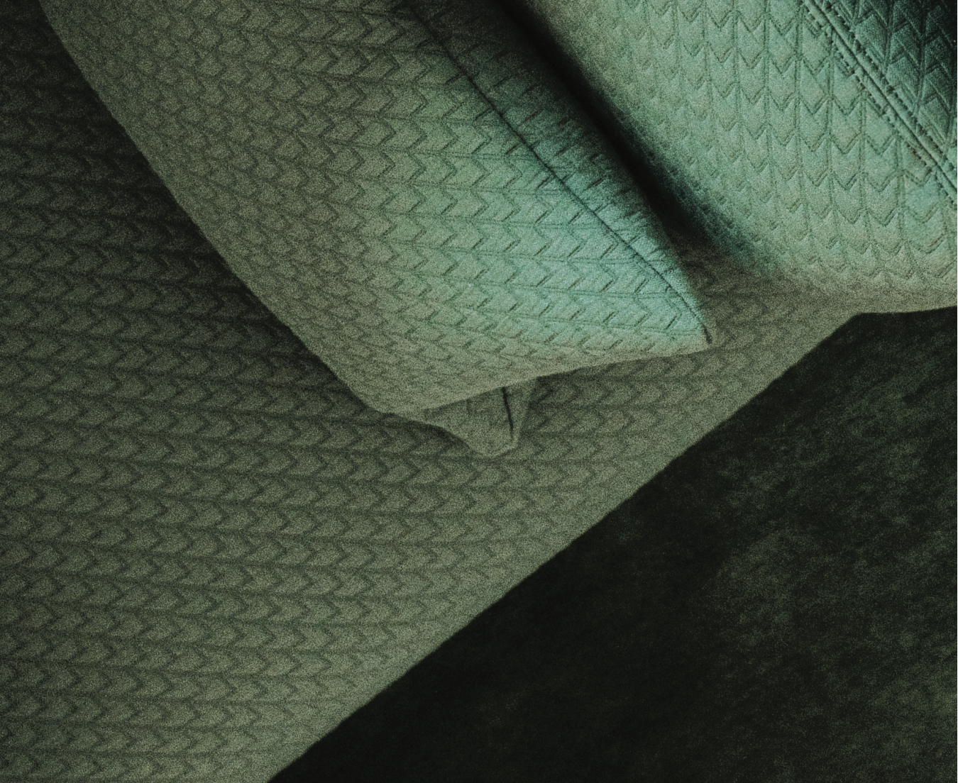
Notice the overall dark green and light blue color palette of this collection of images. While other colors appear in the images and can bring added energy, the overall color scheme is predominantly light blue and dark green. Using colored backdrops, upholstery that aligns with the palette, and a curated wardrobe, the overall aesthetic of the imagery emphasizes the Dealer Connect color strategy.



Gradient Overlay
Add stylization by converting an image to black and white and applying a gradient overlay. This can be useful in creating color harmony with an image or footage that was not originally shot in a color palette that aligns with the Dealer Connect palette.

Shadowy Color Wash
Use natural shadows shot on color-sweep backdrops to add depth and realism. It keeps things minimal while still feeling dimensional—allowing for text or images to layer on top.
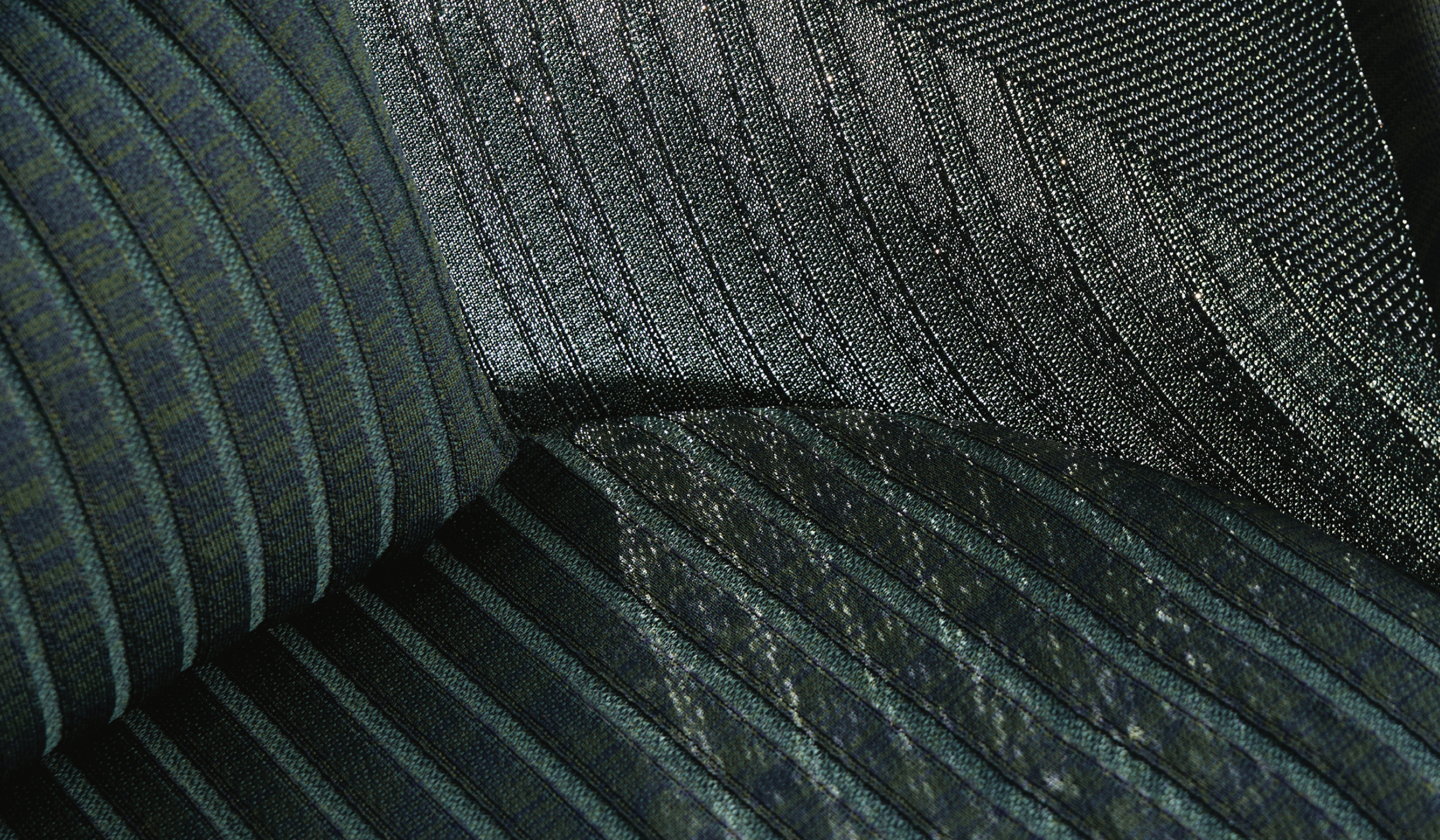
Textured Finishes
Our products are covered in beautiful textures and finishes. Embrace the forms of our furniture and use products upholstered or finished in colors that align with the Dealer Connect color strategy to create tactile washes of color.
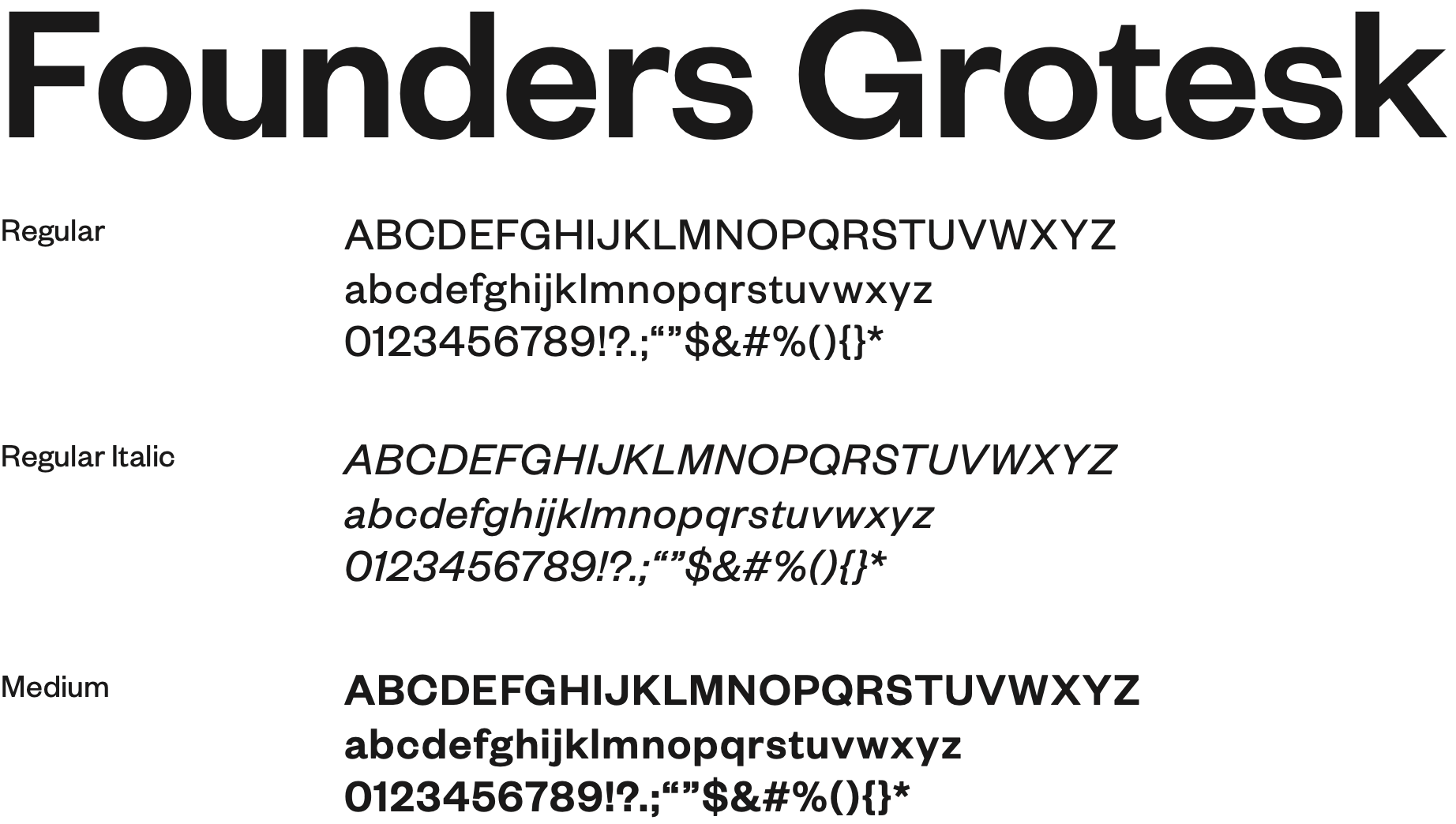
Typography
Founders Grotesk aligns the Dealer Connect branding to the Haworth branding.
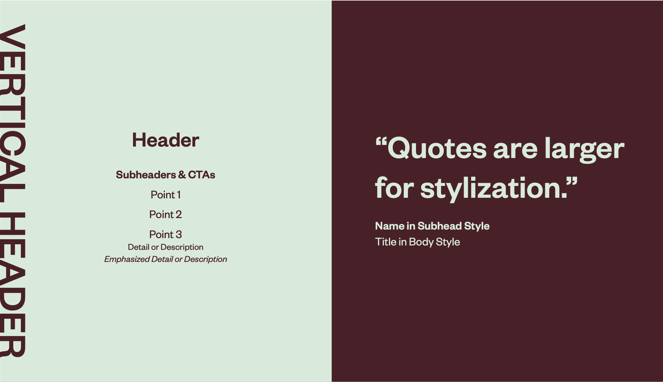
Using standard text styles throughout the program creates cohesion and consistency to create a polished look.
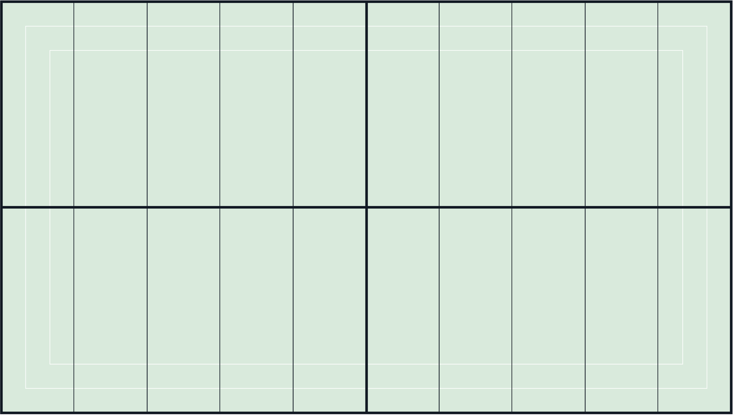
Layout is key in establishing a cohesive and compelling style that brings the Dealer Connect visual identity to life. This 10-column grid system allows for flexibility within the system while providing an underlying structure for the overall package.
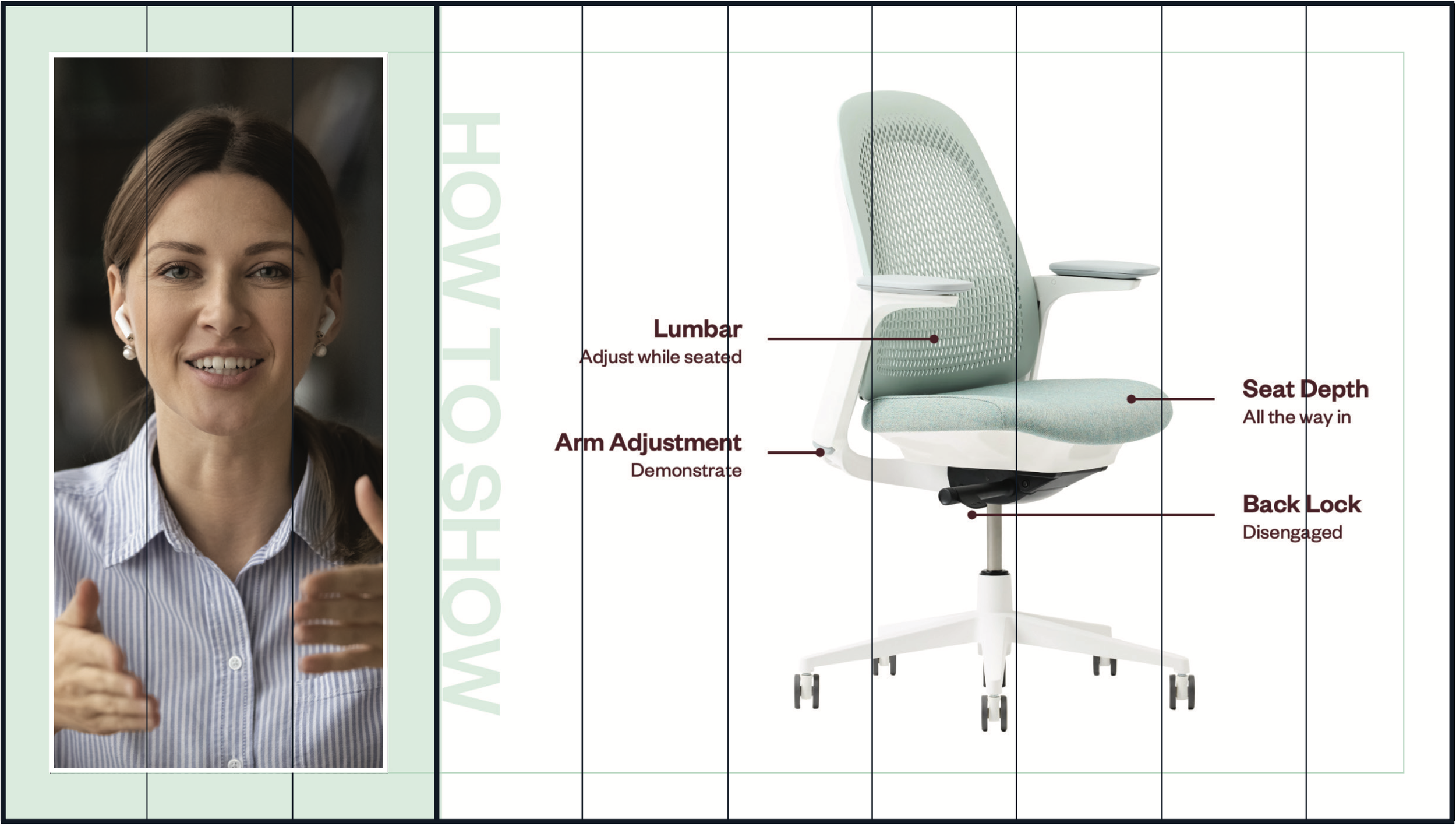
The presenter footage contained within the three-column box utilizes the narrower margin. The frame margin is maintained all the way around the internal content for a consistent border width around the presenter footage.
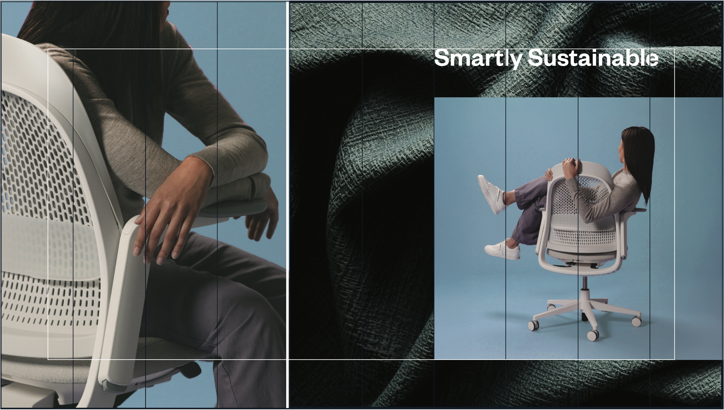
Breaking the overall layout into multiple sections can add interest and energy. Ensure a strong visual break between sections for visual clarity.
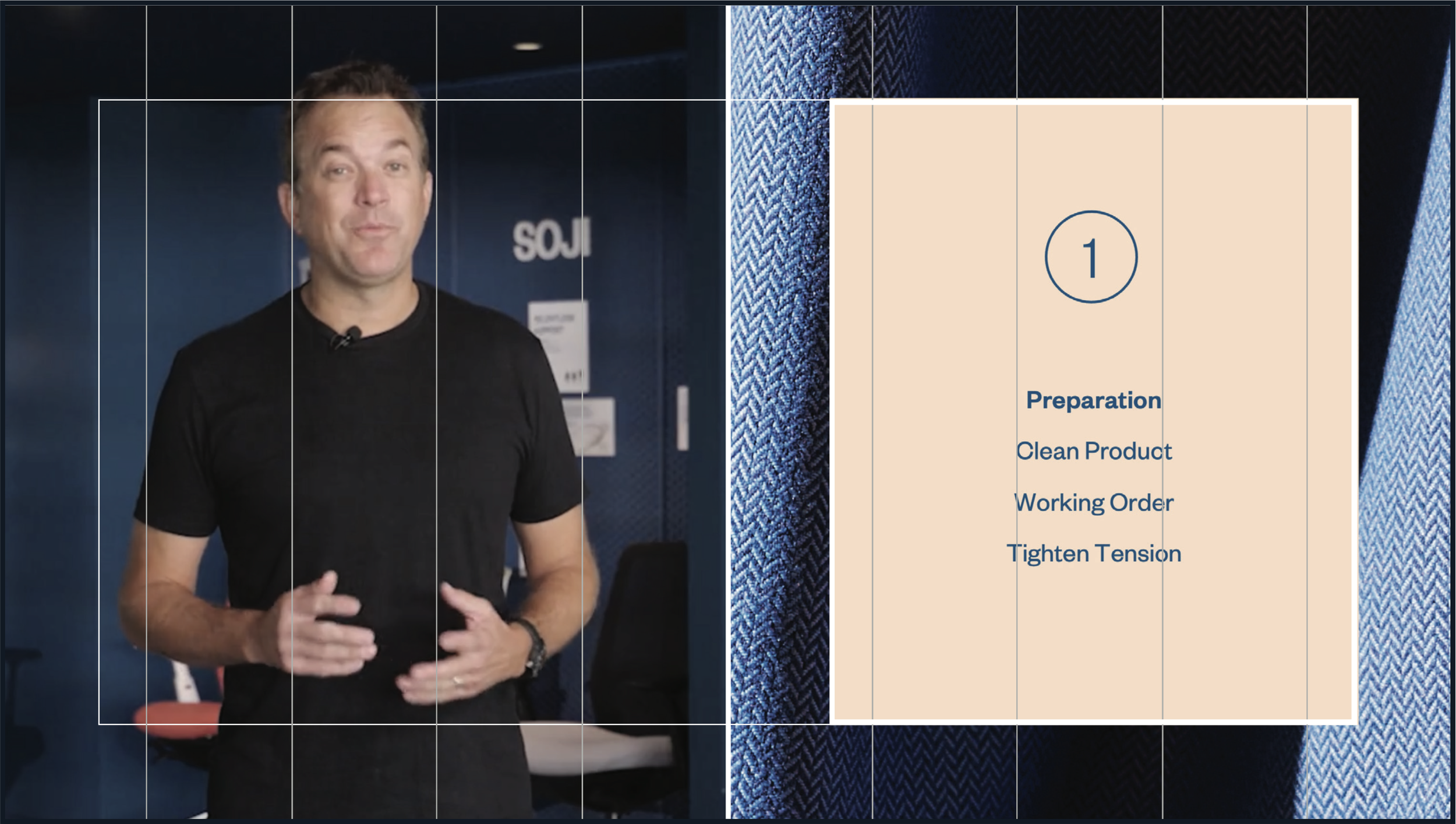
The wider margin is used for textural frames to allow a little more visual information. The 50/50 split in this layout creates a balance between the speaker and content. The speaker adds engagement while the content adds visual reinforcement to the speaker’s message.
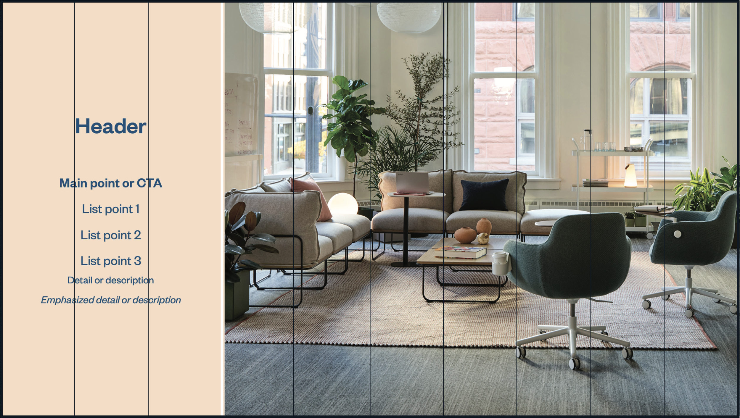
More complex, layered layouts should be complemented by simpler layouts like this 3/7 column split. The over-use of complex layout may cause difficulty for the audience to digest the content. The more content to be absorbed, the similar the layout should be.
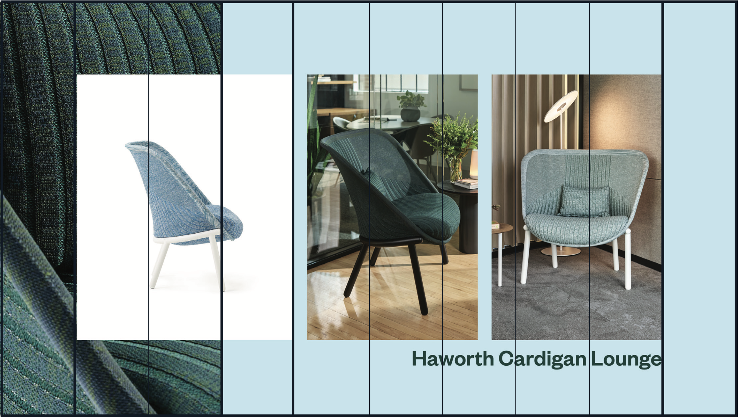
The outside columns were used as the margin width and the perimeter maintains an equal frame. At first glance, the two images to the right might seem to break the grid, but in this case, two pictures were evenly split between five columns, with consistent spacing added between the images.
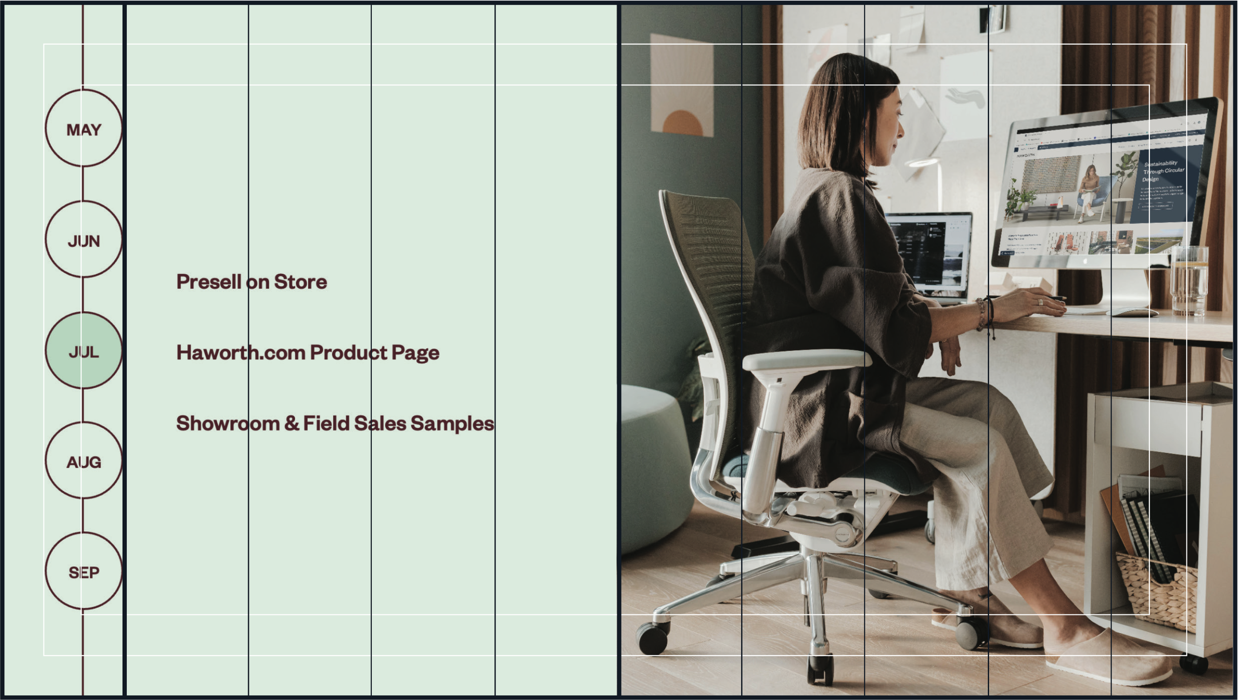
Here, both margins were used to determine the size and placement of the calendar graphic along the left side.
Supers & Motion Graphics
Adding text, graphics, and motion is a strategic design choice that can make your content more engaging and memorable. Supers can help tell a story visually, increase user retention, and capture attention more effectively than simply listening to a presenter.